Snowdrop Aesthetics is a nurse-led aesthetics clinic, run by Jodie who is the founder of Snowdrops Aesthetics. With 12 years of clinical experience, they offer a wide range of non-surgical treatments. The ‘Snowdrop’ on the logo is sentimental to the client hence the brand name & logo.
What problems were they facing?
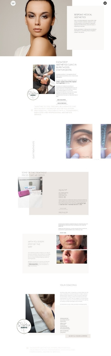
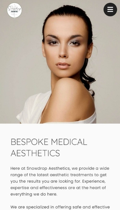
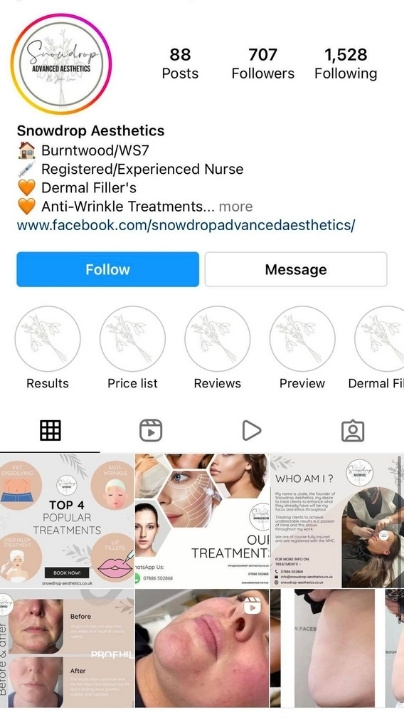
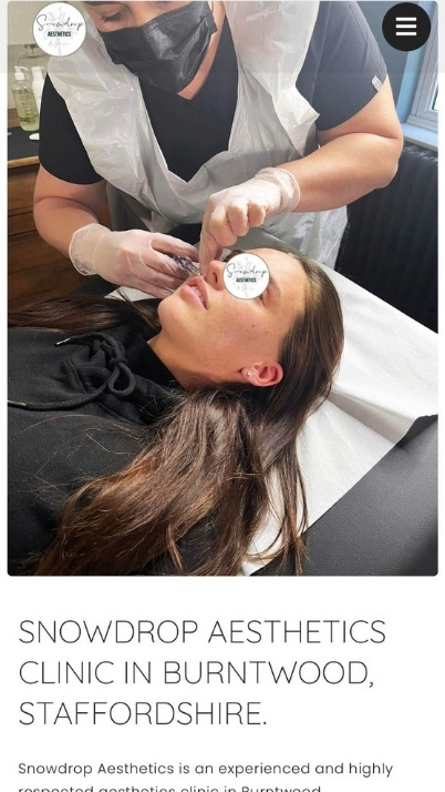
Snowdrop Aesthetics, before coming to us for our services, were struggling with their website and online presence. They needed a new design and branded website to be up and running as before they did not have one. Our client also lacked basic social media updates and needed a new social media presence.
They also had no branding, our client was lacking with online presence which resulted in them not receiving any enquiries. Snowdrops Aesthetics needed to get themselves a website and social media, to get new clients and needed new branding to create brand awareness.
When they approached us the first thing we did was research similar competitors, to understand the company and what works well and what doesn’t. We then spent time creating brand new branding for our client which then went onto the new website and social media. Since completing this project for our client, they now have an up and running a freshly designed website, incorporating brand awareness and having a corporate image. Their social media is now more consistent creating a professional touch.
“Combining simplicity with excitement”
Logo Design Process
Snowdrop Aesthetics originally sent just an image of the current logo, to which to make changes we would usually need an original of the ‘PSD’ file to pull elements from it and make changes. One of the main changes the client wanted to make was to remove the word “advanced” that was on the original logo.
As we didn’t have the ‘PSD’ file we had to redesign the logo to get rid of the word “advanced” whilst trying to make it identical to the original. We achieved this with the help of photoshop as it allowed us to use rulers to align every aspect, also using similar fonts, colour palettes, and any other elements from the original.
The Branding
After gathering all information from our client, we spent time carefully selecting branding elements that complement the company and their service. We decided to select a light grey and cream colour pallet, representing the ‘Aesthetics’ Business. The choice of a light colour pallet emits a minimalist and soft look with a professional touch.
For the branding, we went with a very light grey and cream pallet which represents the ‘Aesthetics’ business very well. It emits a very minimalist and soft look with a professional finish. This colour pallet was also integrated into the social media posts for Snowdrop Aesthetics.
Social Media Marketing
Our client wanted a new and fresh social media to go alongside their new branding and website. We created content for our client and we also managed the social media accounts of Snowdrop Aesthetics. We would create and design social media posts and stories to go across all the platforms they use, we would communicate with our clients to ensure we are fulfilling their specific requests. When creating social media posts we would ensure that the new branding elements are incorporated into the design. To have a successful marketing strategy it is important to create brand awareness within your content.
Mobile
Wrapping things up
After the store went through multiple stages of user testing and improving the infrastructure to allow ultra high resolution imagery with swiftest loading times, we put our work to the test by launching the site alongside their Spring/Summer collection.
Average cart sizes have increased 200% and monthly revenues by over 300% in the first months. As with everything, we kept improving the UX here and there to serve the best possible experience to their customers.
Creating the visual direction
It was finally time to overhaul everything visual. And we left no stone unturned. Our team knew exactly where and how to start: Key components have already been defined during the UX phase so we proper tool box to test our designs against. One of the few things that were set in stone by the client was the use of red as primary color. So from there we chose a very clean and modern direction combined with a uniquely crafted iconography style.
It was finally time to overhaul everything visual. And we left no stone unturned. Our team knew exactly where and how to start: Key components have already been defined during the UX phase so we proper.