We’ve all used booking systems that leave us frustrated, struggling to complete a simple task. At its core, an effective booking system UI design ensures that users can quickly and easily complete their bookings without confusion.
Exceptional booking system UI designers go a step further. The best designs don’t just facilitate a smooth booking process but also enhance the user experience, adding an aesthetic touch that makes the process enjoyable.
This can involve elements such as an innovative, intuitive interaction that guides users to specific actions, or a minimalist, clean layout with smart use of white space, creating a calm and organised atmosphere.
In this article, I’ll explore what makes a good booking system interface—drawing on insights from the Nielsen Norman Group—and highlight eight examples of outstanding booking system UI design, explaining why each one stands out.
When assessing whether a user interface is good—or even exceptional—how can you approach it in a structured way? You might consider its visual appeal and test whether it offers an intuitive, seamless experience. But is there a more objective or formalised approach?
A more formal assessment often involves evaluating the interface based on established usability principles. These principles, such as clarity, consistency, and efficiency, help assess whether the design enables users to achieve their goals with ease. Usability testing and user feedback also provide valuable insights into how well the interface performs in real-world scenarios, making it possible to measure aspects like task completion rates and user satisfaction.
By combining these approaches with qualitative and quantitative data, you can form a more comprehensive, objective assessment of a booking system’s UI.
1. Fresha
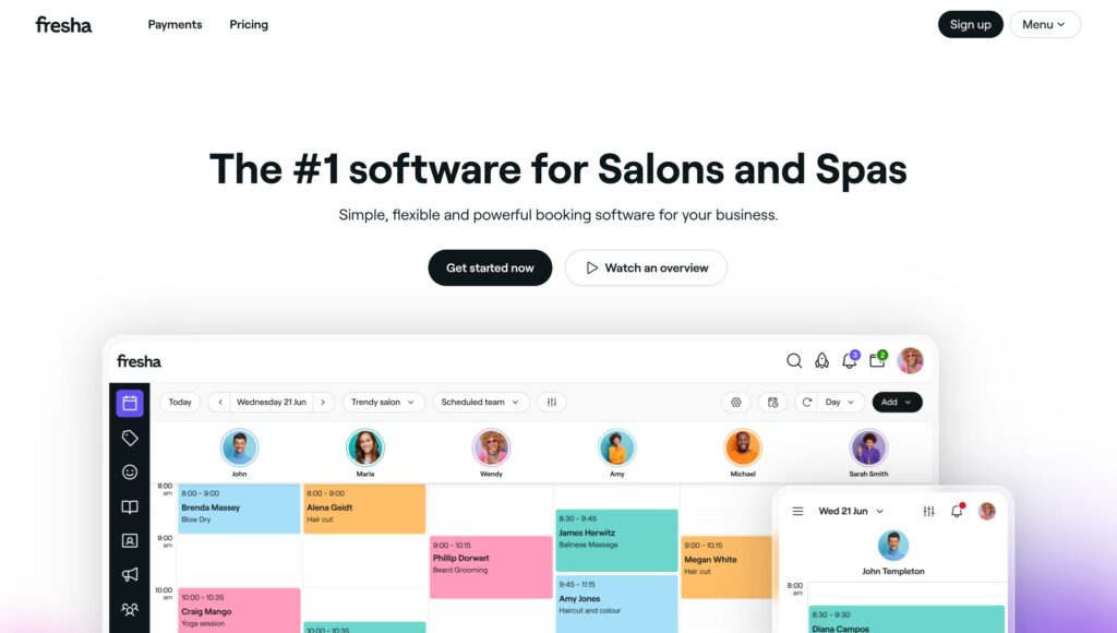
Fresha, an online booking platform, combines simplicity with functionality. Its clean, minimalist design, clear layout, and intuitive navigation provide a seamless user experience.
Upon logging in, users are welcomed with an easy-to-navigate dashboard, making appointment management effortless. The platform’s streamlined interface ensures that scheduling and client interactions are smooth and straightforward.
Fresha’s features, such as automated reminders and integrated payment processing, enhance convenience. The system also offers insightful analytics and reporting, enabling businesses to make informed decisions and optimise their operations. Overall, Fresha delivers a highly efficient and user-friendly booking experience.
2. Treatwell
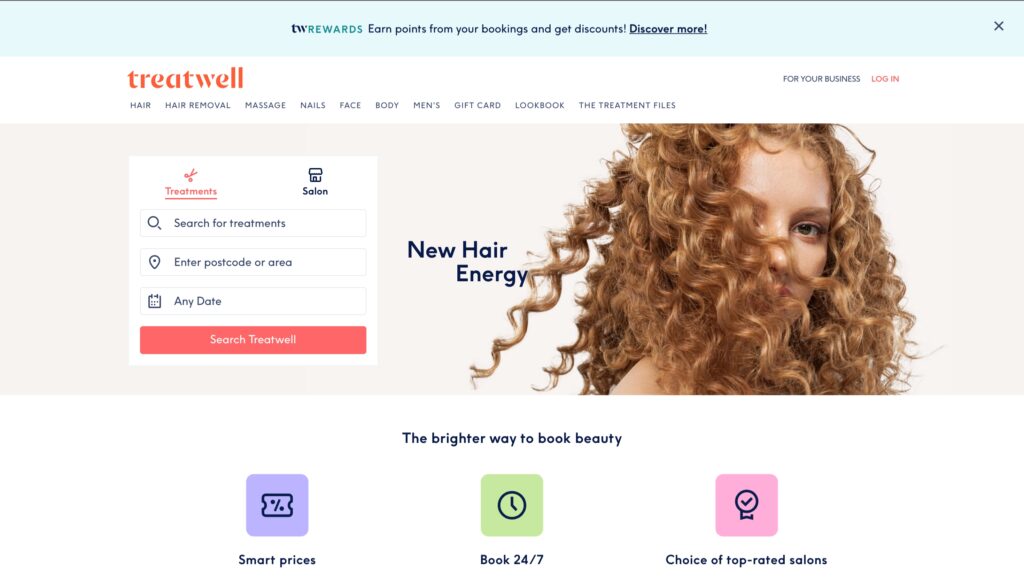
Treatwell revolutionised the beauty and wellness booking experience by making it simple and intuitive. Booking an appointment is often seen as a hassle, but Treatwell focused on making the process effortless.
By cutting out unnecessary steps, Treatwell’s platform zeroes in on what matters most: finding the right treatment at the right time. Users can quickly browse, book, and manage appointments without distractions.
While the design has evolved over time, it remains a prime example of user-friendly interface design. Treatwell continues to offer a seamless, customer-centric experience, making booking beauty services as easy as ever.
Treatwell’s website excels with its user-friendly design, featuring a persistent bar that displays the user’s current selections throughout the booking process. This clever addition allows customers to effortlessly view and adjust their choices without needing to remember previous steps.
The interface is designed to keep users focused on their goal, ensuring a quick and efficient booking experience. By simplifying the process, Treatwell makes it easy for users to book their beauty and wellness appointments with minimal hassle.
3. Booksy
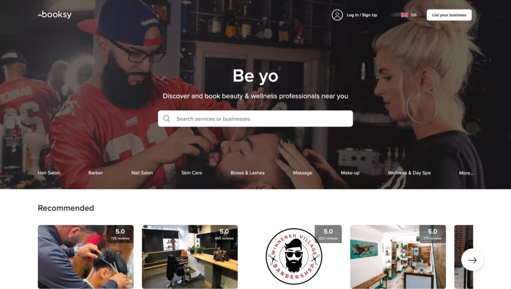
Booksy, like Airbnb, focuses on simplifying the booking experience right from the home screen.
With its approachable, user-friendly design and clear call-to-action prompts, such as What service are you looking for today?, Booksy welcomes users and guides them through the process with ease. This friendly tone helps customers feel comfortable while navigating the platform.
For the initial booking, users only need to specify key details: the service they want, their preferred time, and the professional they want to see. By delaying additional options until later, Booksy keeps the experience straightforward and intuitive, making it easy for users to book appointments.
Booksy’s listing pages are designed with clarity and transparency, displaying any additional fees upfront to ensure users know exactly what to expect. Below this information is the prominent Request to Book button, making it easy for users to finalise their appointments without hassle.
Once a user clicks Request to Book, they are directed to a detailed checkout page. On the right, users can view the service, pricing, and booking details, eliminating the need to remember information from the previous page.
On the left, rather than diving straight into payment, the page invites users to provide a personal note to their chosen professional. This step fosters a sense of connection before the transaction, creating a more human experience and reinforcing Booksy’s focus on building relationships between service providers and clients.
The interface reflects this personal approach with thoughtful copy, engaging imagery, and a focus on user comfort, helping to establish trust and encourage a positive experience for both parties.
4. Vagaro
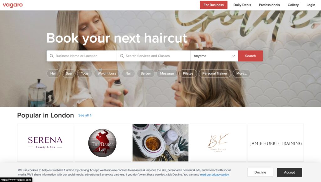
Vagaro’s UX/UI design is highly effective due to its user-focused approach, intuitive navigation, and clean layout. The platform is designed to provide a smooth browsing experience, prioritising functionality and easy organisation, making it simple for users to find services and information. The use of vibrant images and consistent branding improves engagement, while its responsive design ensures accessibility across all devices. By blending visual appeal with practical usability, Vagaro delivers a platform that caters to both user needs and business goals.
Moreover, Vagaro’s design incorporates well-placed calls-to-action and fast loading speeds, ensuring an efficient experience. Interactive elements, such as filters and search features, simplify service discovery, while personalised recommendations and clear service details enhance the user journey. By aligning design elements with user behaviour, Vagaro not only meets customer expectations but also strengthens brand loyalty and satisfaction.
5. Phorest
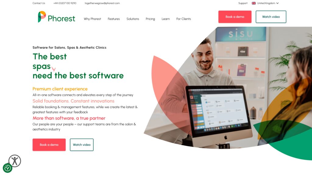
The UI design of Phorest, as a booking system, is both clean and effective, prioritising simplicity and ease of use. The intuitive layout, paired with clear typography and high-quality visuals, allows users to easily navigate the platform. White space is used strategically to ensure content stands out without feeling cluttered, creating an organised environment for a smooth booking experience. The interface also features clear calls-to-action and menus that guide users effortlessly through their booking process.
Phorest is fully responsive, optimised for all devices to provide a seamless experience across desktops, tablets, and smartphones. Consistent visual elements, such as branding and imagery, reinforce the platform’s identity while maintaining a sleek and functional design. This combination of simplicity and practicality makes Phorest an engaging and user-friendly system that enhances the booking process.