We’ve all encountered websites and applications that make us feel like throwing our devices across the room in frustration—or at least, I hope that’s not just my experience. At its core, good website UI design ensures that users can complete the task they came to the site to do easily and without confusion.
Truly exceptional UI designers go beyond this. The best UI designs not only enable seamless task completion but also delight users aesthetically and enhance their overall experience.
This can encompass a variety of elements: a sleek, innovative animated interaction that intuitively guides the user’s attention to a specific feature, or a minimalist, uncluttered layout with clever use of white space that instils a sense of calm, for instance.
In this article, I’ll explore what makes a good user interface—with a bit of insight from the Nielsen Norman Group—before delving into eight examples of outstanding website UI design and explaining my choices.
If you’re trying to assess whether a user interface is good—or even exceptional—how do you go about it? You can judge whether you find the interface visually appealing and test whether it provides an intuitive, straightforward experience. But is there a more objective or formalised approach?
I personally always refer to the usability characteristics outlined by the research company Nielsen Norman Group.
Nielsen defines usability through five key characteristics: learnability, efficiency, memorability, errors, and satisfaction.
- Learnability: Can users complete their tasks with minimal difficulty?-
- Efficiency: Does the interface enable users to complete tasks quickly?
- Memorability: After leaving a website, how easily can users remember how to use it when they return?
- Errors: How effectively does the interface minimise the likelihood of user errors, and how well does it support users in correcting mistakes?
- Satisfaction: Do users find the design enjoyable to interact with?
Beyond these standards, a truly excellent UI should reflect the brand’s personality, helping it stand out from competitors and offering users a delightful experience. Let’s explore a few examples where I believe companies have nailed their website UI design.
1. Medium
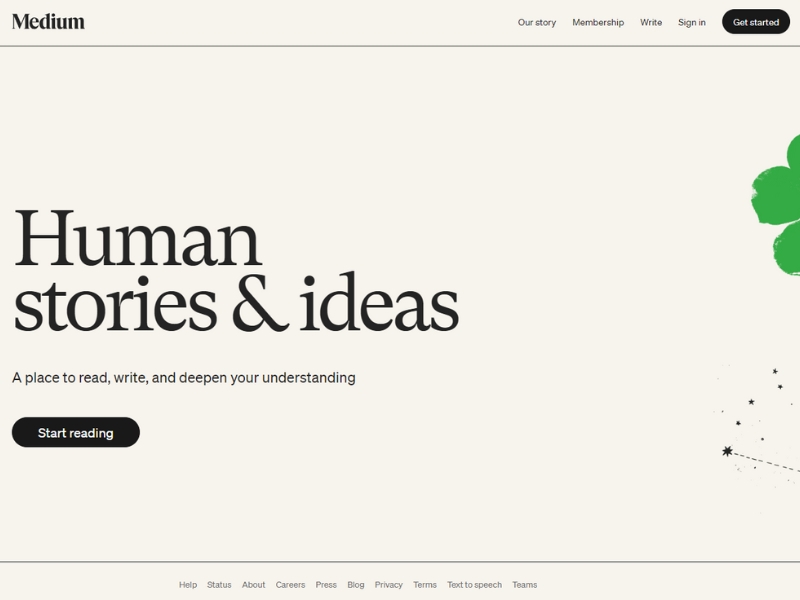
Medium, an online platform for reading and publishing, is as beautiful as it is functional. With its minimalist use of colour, generous line spacing, and expertly chosen typography, the website strikes the perfect balance.
On Medium, content takes precedence. Once logged in, users are greeted by a box at the top of the article list reading Write here, which encourages everyone to start writing effortlessly.
Clicking the Write a Story link opens a virtually blank white page, removing distractions and offering a clean, focused space for writing.
Articles are displayed in a single-column layout, making the content easy to read and absorb. Thoughtful features, such as estimated reading times and the ability to highlight and respond directly to specific parts of articles, make Medium an exceptional platform for an enjoyable and seamless editorial experience.
2. Virgin America
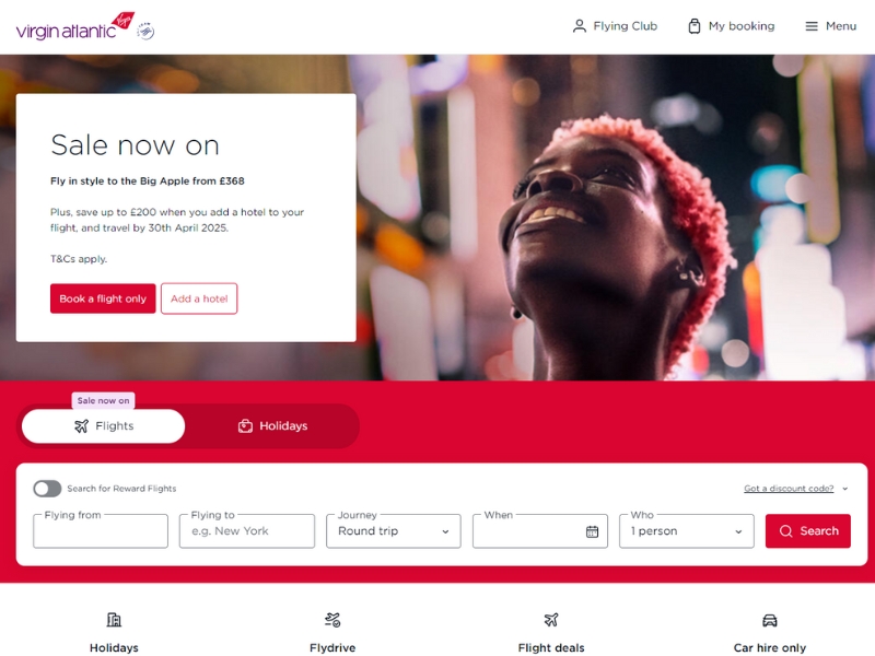
When it comes to making the flight booking process simple and user-friendly, Virgin America was a pioneer—if not the first—to truly prioritise the user’s needs. Let’s face it, booking a flight is often seen as a tedious task.
Much like a dishwasher spares us the hassle of scrubbing dishes, Virgin America’s website streamlined the experience by focusing on the most essential question: Where would you like to go? By stripping away unnecessary content, users could dive straight into the booking process without distraction.
While the design might now feel somewhat outdated, it deserves recognition as a groundbreaking example of user-centred interface design. Unfortunately, since merging with Alaska Air, their clean and intuitive approach has given way to a noticeably more cluttered interface.
Let’s turn our attention to what made Virgin Atlantic’s website so effective. Throughout the booking process, a persistent bar at the top of the screen displayed the user’s current selections. This simple yet clever feature ensured that users could always see and update their choices without needing to rely on memory.
The interface was thoughtfully designed to help users stay focused on their goal, allowing them to complete the booking process quickly and efficiently.
3. Airbnb
Airbnb’s website UI excels in two key areas: facilitating the booking of accommodations and fostering trust between complete strangers.
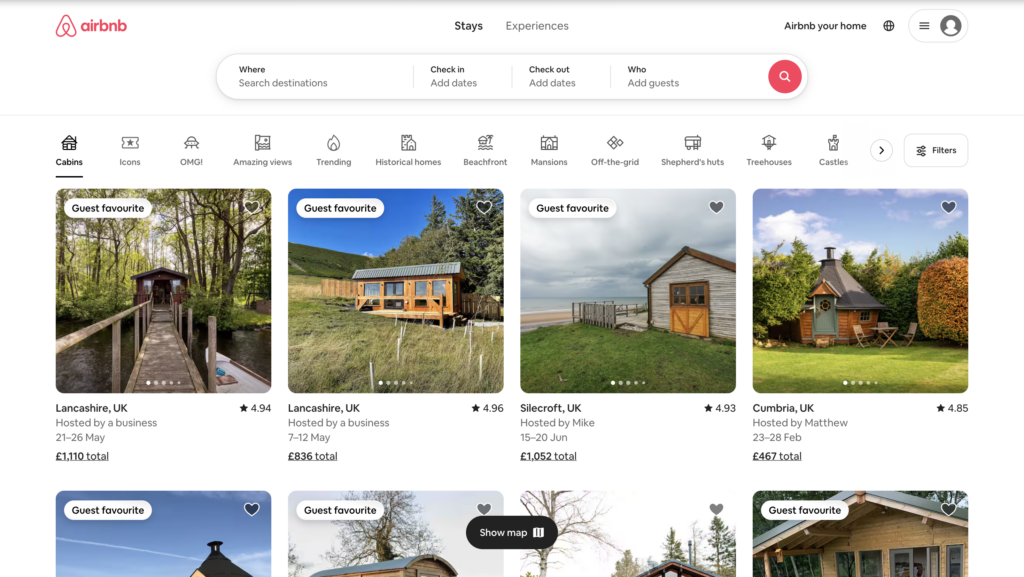
Airbnb, like Virgin Atlantic, places a strong emphasis on simplifying the booking process straight from the home screen.
With its signature conversational tone, such as the friendly What can we help you find, Edward? and clear, helpful cue text, users are both warmly welcomed and seamlessly guided to begin planning their stay.
This conversational prompt to begin searching is a charming way to reflect the brand’s personality while keeping the process of finding a place to stay straightforward.
For the initial search, users only need to specify three details: their destination, the duration of their stay, and the number of guests. By postponing additional filters until later in the process, Airbnb creates an experience that feels streamlined, user-friendly, and approachable.
The listing pages clearly outline any additional fees, ensuring transparency and simplicity for users. Directly beneath this information is the prominent Request to Book button, designed as one of the brightest elements on the page to encourage users to finalise their booking effortlessly.
Once a user clicks ‘Request to Book,’ they are directed to a checkout page. On the right, the listing, pricing, and booking details are prominently displayed, reducing the need for users to remember information from the previous page.
On the left, instead of jumping straight to payment, the page invites users to say hello to your host and tell them why you’re coming. By prioritising this personal interaction before payment, Airbnb fosters a sense of connection between guest and host, aligning perfectly with its mission of bringing people together.
The interface also reflects this ethos beautifully through carefully crafted copy and the use of engaging photos and videos. This thoughtful approach creates an emotional tone that establishes trust between strangers, highlighting Airbnb’s commitment to building relationships over transactions.
4. Boosted Boards
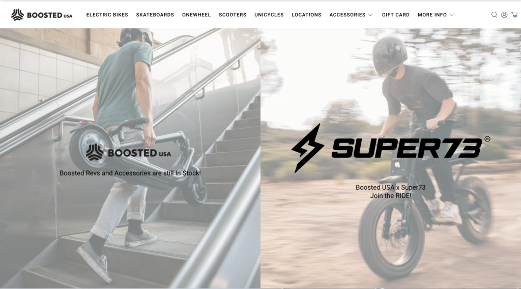
BoostedUSA’s UX/UI design is effective due to its user-centric approach, intuitive navigation, and visually appealing layout. The design ensures a seamless browsing experience by prioritising functionality and clear organisation, making it easy for users to find products and information. The use of vibrant visuals and consistent branding enhances engagement, while responsive design ensures accessibility across devices. By combining aesthetic appeal with practical usability, BoostedUSA creates a platform that caters to both user needs and business goals.
Additionally, BoostedUSA’s UX/UI design incorporates strategic calls-to-action and optimised loading speeds, ensuring a smooth and efficient shopping experience. The thoughtful placement of interactive elements, such as filters and search functionality, simplifies product discovery and selection. Personalised recommendations and clear product details further enhance the user journey, building trust and encouraging conversions. By aligning design elements with user behaviour, BoostedUSA not only meets customer expectations but also strengthens brand loyalty and satisfaction.
5. Apple
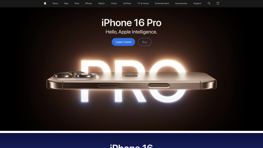
Last but certainly not least, the UI design of the Apple website is both simple and effective, reflecting the brand’s minimalist approach. The clean layout focuses on high-quality visuals and clear typography, allowing users to easily navigate the site. Strategic use of white space ensures that the content stands out without feeling cluttered, creating a calm and organised environment. The design also prioritises ease of use, with intuitive menus and clear calls-to-action guiding users effortlessly through their journey.
The Apple website’s UI design is highly responsive and optimised for all devices, ensuring a smooth user experience across desktops, tablets, and smartphones. The consistency in visual elements, from the iconic Apple logo to the product imagery, reinforces brand identity while maintaining a sleek and functional interface. This combination of simplicity and practicality creates an engaging, user-friendly experience that encourages exploration and conversion.